目录
- 1 数据预处理
- 1.1 股票历史数据csv文件读取
- 1.2 关键数据——在csv文件中选择性提取“列”
- 1.3 数据类型转换
- 1.4 数据按列提取并累加性存入列表
- 2 pyecharts实现数据可视化
- 2.1 导入库
- 2.2 初始化画布
- 2.3 根据需要传入关键性数据并画图
- 2.4 将生成的文件形成HTML代码并下载
- 2.5 完整代码展示
- 3 结果展示
投资有风险,选择需谨慎。 股票交易数据分析可直观股市走向,对于如何把握股票行情,快速解读股票交易数据有不可替代的作用!
1 数据预处理
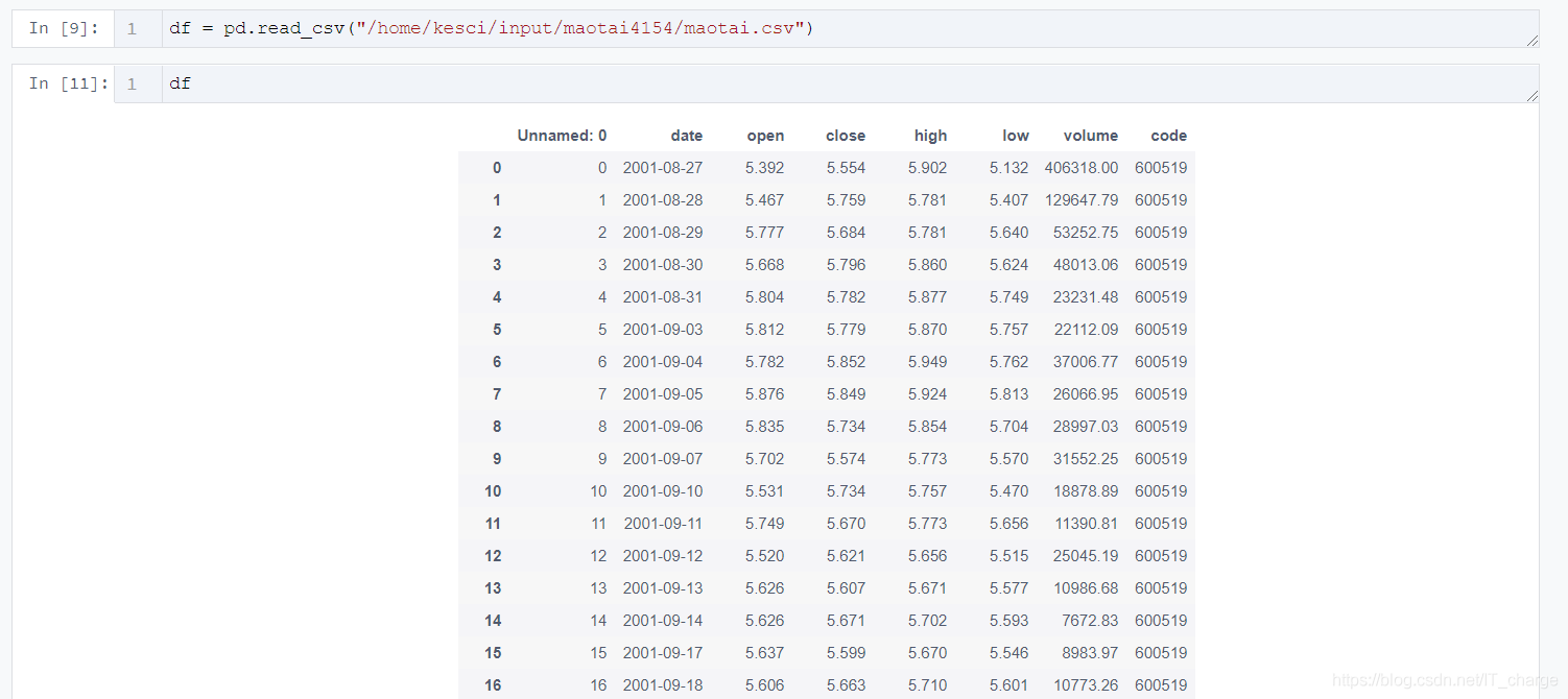
1.1 股票历史数据csv文件读取
import pandas as pd
import csv
df = pd.read_csv("/home/kesci/input/maotai4154/maotai.csv")
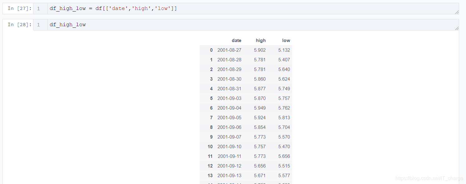
1.2 关键数据——在csv文件中选择性提取“列”
df_high_low = df[['date','high','low']]
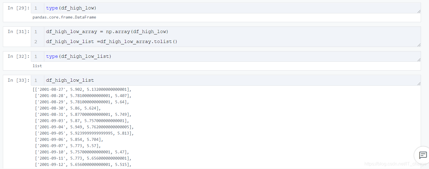
1.3 数据类型转换
df_high_low_array = np.array(df_high_low)
df_high_low_list =df_high_low_array.tolist()
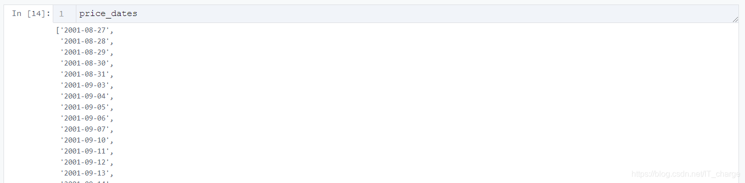
1.4 数据按列提取并累加性存入列表
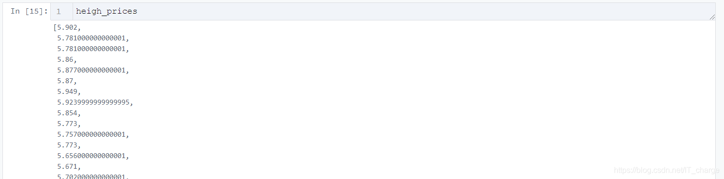
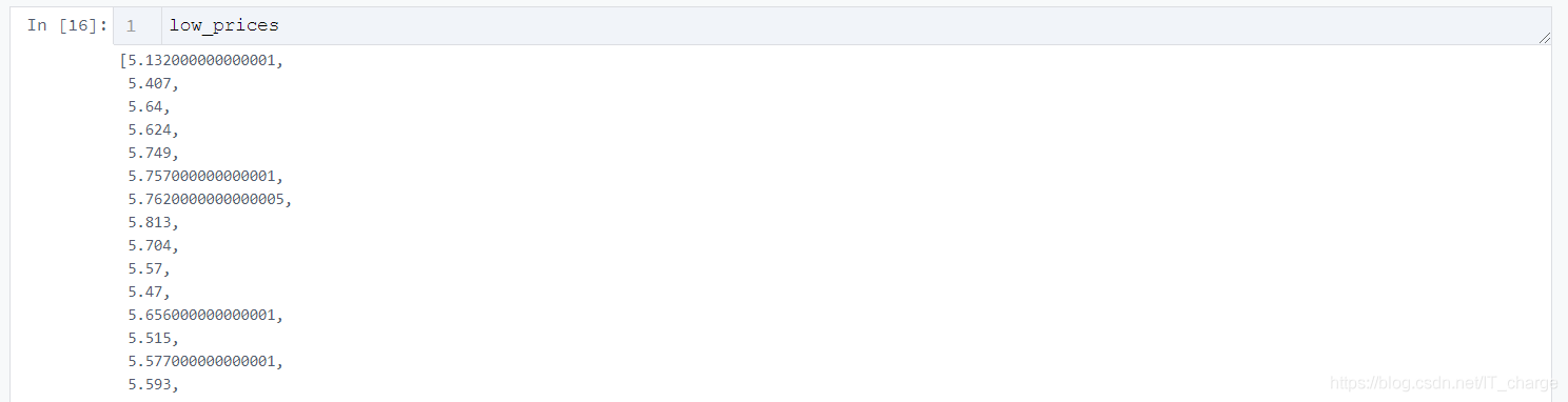
price_dates, heigh_prices, low_prices = [], [], []
for content in zip(df_high_low_list):
    price_date = content[0][0]
    heigh_price = content[0][1]
    low_price = content[0][2]
    price_dates.append(price_date)
    heigh_prices.append(heigh_price)
    low_prices.append(low_price)
2 pyecharts实现数据可视化
2.1 导入库
import pyecharts.options as opts
from pyecharts.charts import Line
2.2 初始化画布
Line(init_opts=opts.InitOpts(width="1200px", height="600px"))
2.3 根据需要传入关键性数据并画图
    .add_yaxis(
        series_name="最低价",
        y_axis=low_prices,
        markpoint_opts=opts.MarkPointOpts(
            data=[opts.MarkPointItem(value=-2, name="周最低", x=1, y=-1.5)]
        ),
        markline_opts=opts.MarkLineOpts(
            data=[
                opts.MarkLineItem(type_="average", name="平均值"),
                opts.MarkLineItem(symbol="none", x="90%", y="max"),
                opts.MarkLineItem(symbol="circle", type_="max", name="最高点"),
            ]
        ),
    )
tooltip_opts=opts.TooltipOpts(trigger="axis"),
toolbox_opts=opts.ToolboxOpts(is_show=True),
xaxis_opts=opts.AxisOpts(type_="category", boundary_gap=True)
2.4 将生成的文件形成HTML代码并下载
.render("HTML名字填这里.html")

2.5 完整代码展示
import pyecharts.options as opts
from pyecharts.charts import Line
(
Line(init_opts=opts.InitOpts(width="1200px", height="600px"))
.add_xaxis(xaxis_data=price_dates)
.add_yaxis(
series_name="最高价",
y_axis=heigh_prices,
markpoint_opts=opts.MarkPointOpts(
data=[
opts.MarkPointItem(type_="max", name="最大值"),
opts.MarkPointItem(type_="min", name="最小值"),
]
),
markline_opts=opts.MarkLineOpts(
data=[opts.MarkLineItem(type_="average", name="平均值")]
),
)
.add_yaxis(
series_name="最低价",
y_axis=low_prices,
markpoint_opts=opts.MarkPointOpts(
data=[opts.MarkPointItem(value=-2, name="周最低", x=1, y=-1.5)]
),
markline_opts=opts.MarkLineOpts(
data=[
opts.MarkLineItem(type_="average", name="平均值"),
opts.MarkLineItem(symbol="none", x="90%", y="max"),
opts.MarkLineItem(symbol="circle", type_="max", name="最高点"),
]
),
)
.set_global_opts(
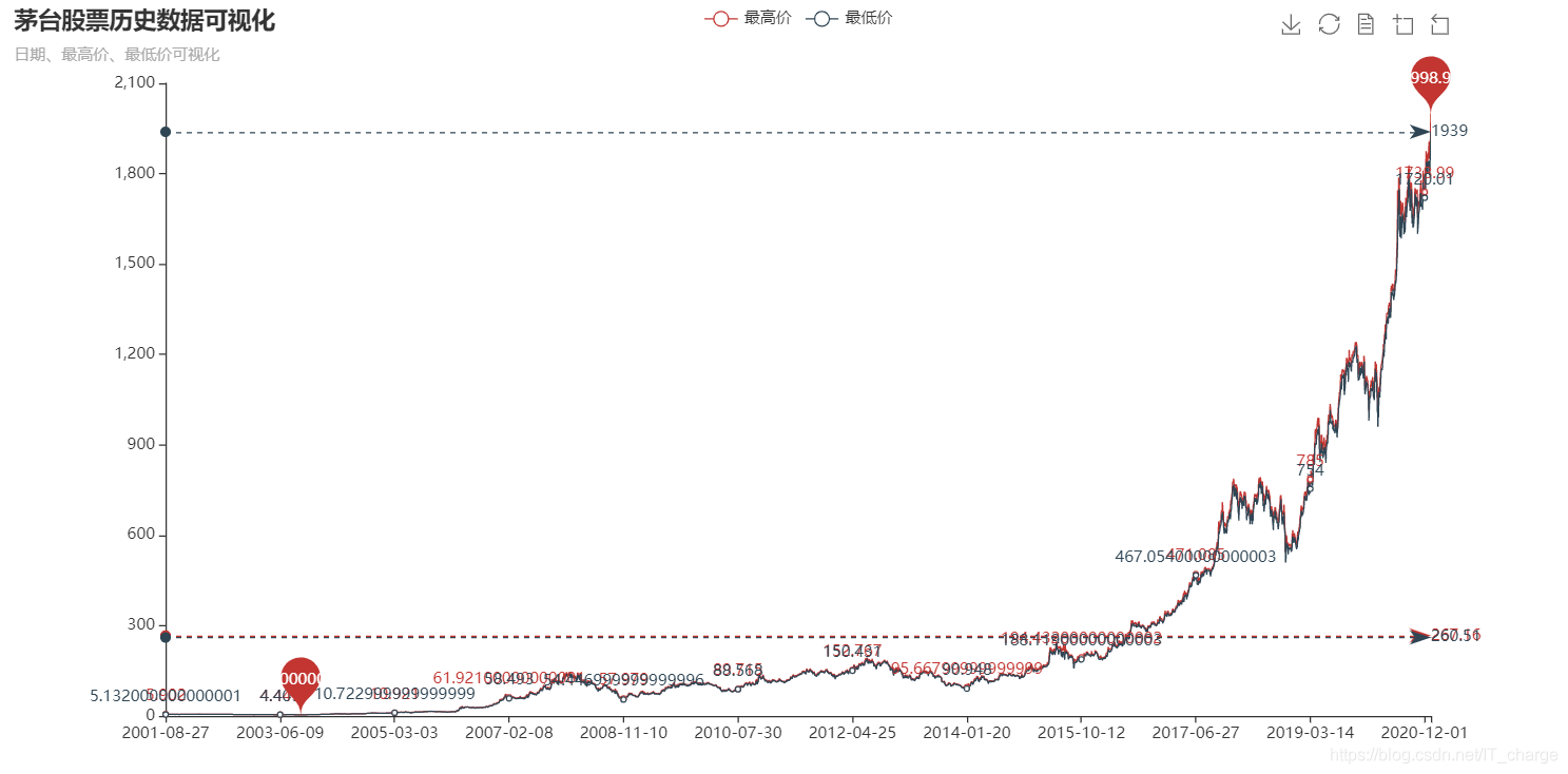
title_opts=opts.TitleOpts(title="茅台股票历史数据可视化", subtitle="日期、最高价、最低价可视化"),
tooltip_opts=opts.TooltipOpts(trigger="axis"),
toolbox_opts=opts.ToolboxOpts(is_show=True),
xaxis_opts=opts.AxisOpts(type_="category", boundary_gap=True),
)
.render("everyDayPrice_change_line_chart2.html")
)
3 结果展示

到此这篇关于python实现股票历史数据可视化分析案例的文章就介绍到这了,更多相关python股票数据可视化内容请搜索脚本之家以前的文章或继续浏览下面的相关文章希望大家以后多多支持脚本之家!
您可能感兴趣的文章:- 利用Python进行数据可视化的实例代码
- python数据可视化之matplotlib.pyplot基础以及折线图
- 浅谈哪个Python库才最适合做数据可视化
- python数据可视化plt库实例详解
- 学会Python数据可视化必须尝试这7个库
- Python中seaborn库之countplot的数据可视化使用
- Python数据可视化之基于pyecharts实现的地理图表的绘制
- Python爬虫实战之爬取京东商品数据并实实现数据可视化
- Python数据可视化之用Matplotlib绘制常用图形
- Python数据可视化之绘制柱状图和条形图
- python用pyecharts实现地图数据可视化
- python数据可视化 – 利用Bokeh和Bottle.py在网页上展示你的数据


 咨 询 客 服