目录
- python通过Matplotlib绘制常见的几种图形
- 一、使用matplotlib对几种常见的图形进行绘制
- 1、柱状图
- 2、水平绘制柱状图
- 3、多个柱状图
- 4、叠加型柱状图
- 5、散点图
- 6、气泡图
- 7、直方图
- 8、箱线图
- 二、添加文字描述
- 三、多个图形描绘 subplots
- 四、使用Pandas 绘图
- 1、散点图
- 2、绘制柱状图
- 3、堆积的柱状图
- 4、水平的柱状图
- 5、直方图
- 6、箱线图
python通过Matplotlib绘制常见的几种图形
一、使用matplotlib对几种常见的图形进行绘制
import numpy as np
import matplotlib.pyplot as plt
%matplotlib inline #写了这个就可以不用写plt.show()
plt.rcParams['font.sans-serif']=['SimHei'] #用来正常显示中文标签
plt.rcParams['axes.unicode_minus']=False #用来正常显示负号
X = np.linspace(0, 2*np.pi,100)# 均匀的划分数据
Y = np.sin(X)
Y1 = np.cos(X)
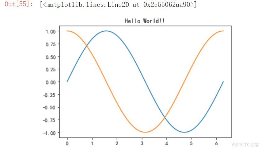
plt.title("Hello World!!")
plt.plot(X,Y)
plt.plot(X,Y1)
X = np.linspace(0, 2*np.pi,100)
Y = np.sin(X)
Y1 = np.cos(X)
plt.subplot(211) # 等价于 subplot(2,1,1)  #一个图版画两个图
plt.plot(X,Y)

plt.subplot(212)
plt.plot(X,Y1,color = 'r')
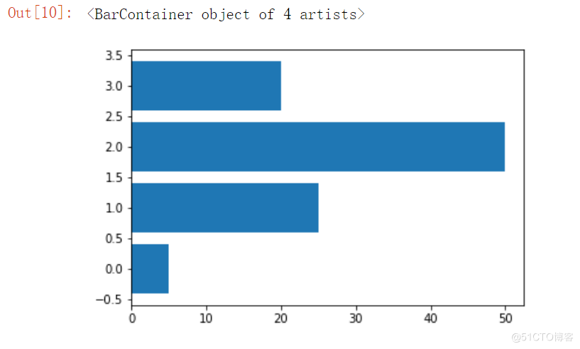
1、柱状图
data = [5,25,50,20]
plt.bar(range(len(data)),data)

2、水平绘制柱状图
data = [5,25,50,20]
plt.barh(range(len(data)),data)
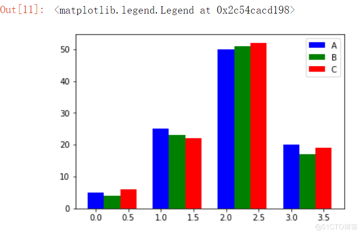
3、多个柱状图
data = [[5,25,50,20],
        [4,23,51,17],
        [6,22,52,19]]
X = np.arange(4)

plt.bar(X + 0.00, data[0], color = 'b', width = 0.25,label = "A")
plt.bar(X + 0.25, data[1], color = 'g', width = 0.25,label = "B")
plt.bar(X + 0.50, data[2], color = 'r', width = 0.25,label = "C")

# 显示上面设置的 lable
plt.legend()
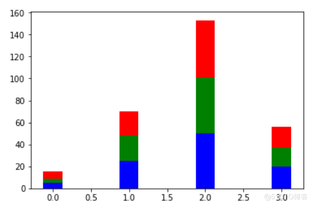
4、叠加型柱状图
data = [[5,25,50,20],
        [4,23,51,17],
        [6,22,52,19]]
X = np.arange(4)

plt.bar(X, data[0], color = 'b', width = 0.25)
plt.bar(X, data[1], color = 'g', width = 0.25,bottom = data[0])
plt.bar(X, data[2], color = 'r', width = 0.25,bottom = np.array(data[0]) + np.array(data[1]))

plt.show()
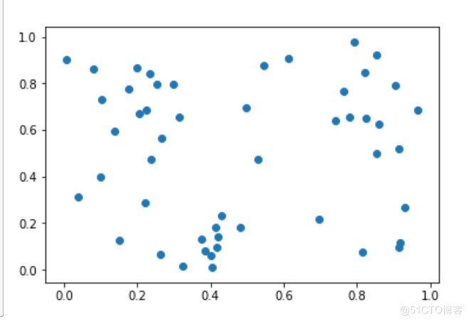
5、散点图
N = 50
x = np.random.rand(N)
y = np.random.rand(N)

plt.scatter(x, y)
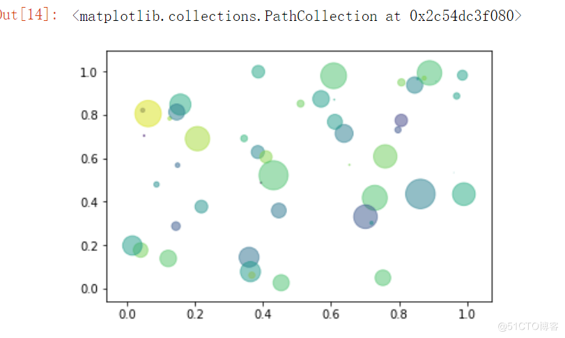
6、气泡图
N = 50
x = np.random.rand(N)
y = np.random.rand(N)
colors = np.random.randn(N) # 颜色可以用数值表示
area = np.pi * (15 * np.random.rand(N))**2  #  调整大小

plt.scatter(x, y, c=colors, alpha=0.5, s = area)
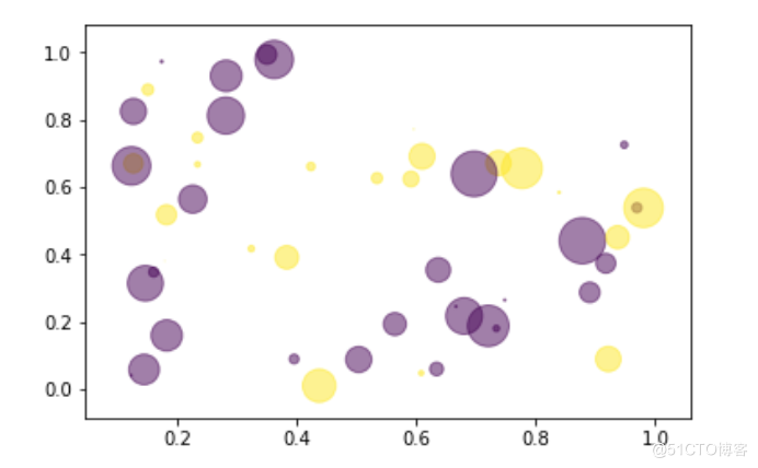
N = 50
x = np.random.rand(N)
y = np.random.rand(N)
colors = np.random.randint(0,2,size =50)
plt.scatter(x, y, c=colors, alpha=0.5,s = area)
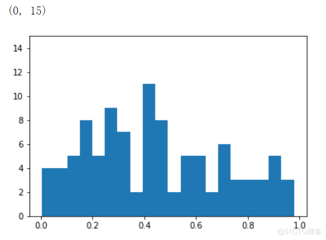
7、直方图
a = np.random.rand(100)
plt.hist(a,bins= 20)
plt.ylim(0,15)
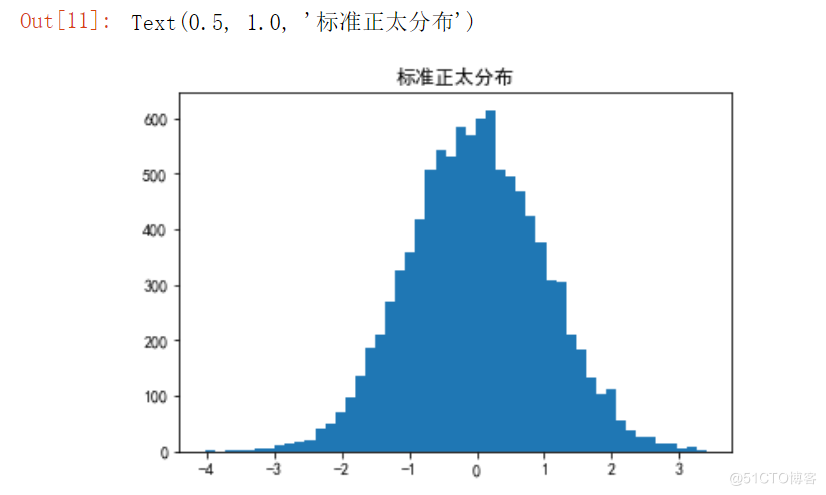
a = np.random.randn(10000)
plt.hist(a,bins=50)
plt.title("标准正太分布")
8、箱线图
x = np.random.randint(20,100,size = (30,3))
plt.boxplot(x)
plt.ylim(0,120)
# 在x轴的什么位置填一个 label,我们这里制定在 1,2,3 位置,写上 A,B,C
plt.xticks([1,2,3],['A','B','C'])

plt.hlines(y = np.median(x,axis = 0)[0] ,xmin =0,xmax=3)

二、添加文字描述
1、文字描述一
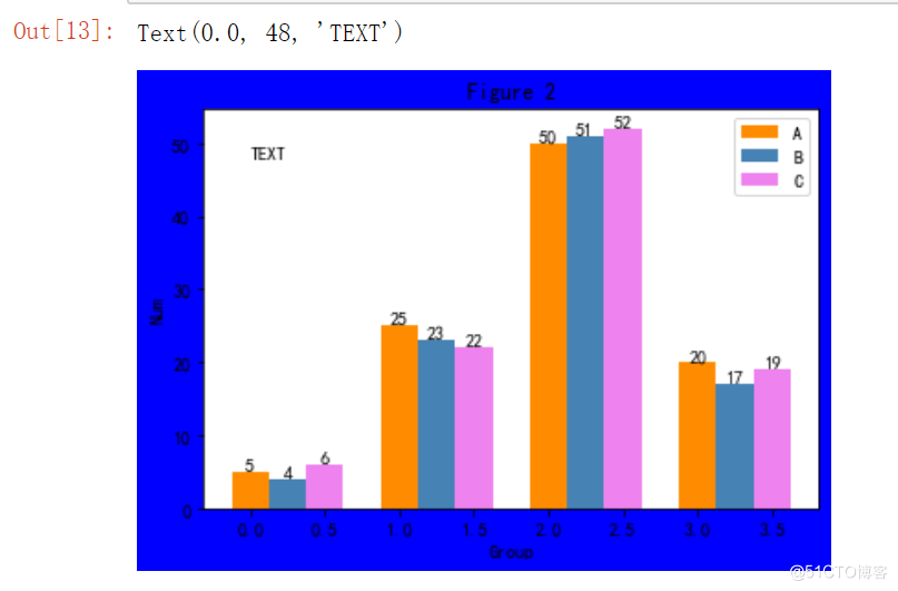
# 设置画布颜色为 blue
fig, ax = plt.subplots(facecolor='blue')

# y 轴数据
data = [[5,25,50,20],
        [4,23,51,17],
        [6,22,52,19]]
X = np.arange(4)

plt.bar(X+0.00, data[0], color = 'darkorange', width = 0.25,label = 'A')
plt.bar(X+0.25, data[1], color = 'steelblue', width = 0.25,label="B")
plt.bar(X+0.50, data[2], color = 'violet', width = 0.25,label = 'C')

ax.set_title("Figure 2")
plt.legend()

# 添加文字描述 方法一
W = [0.00,0.25,0.50]
for i in range(3):
    for a,b in zip(X+W[i],data[i]):
        plt.text(a,b,"%.0f"% b,ha="center",va= "bottom")

plt.xlabel("Group")
plt.ylabel("Num")
plt.text(0.0,48,"TEXT")
2、文字描述二
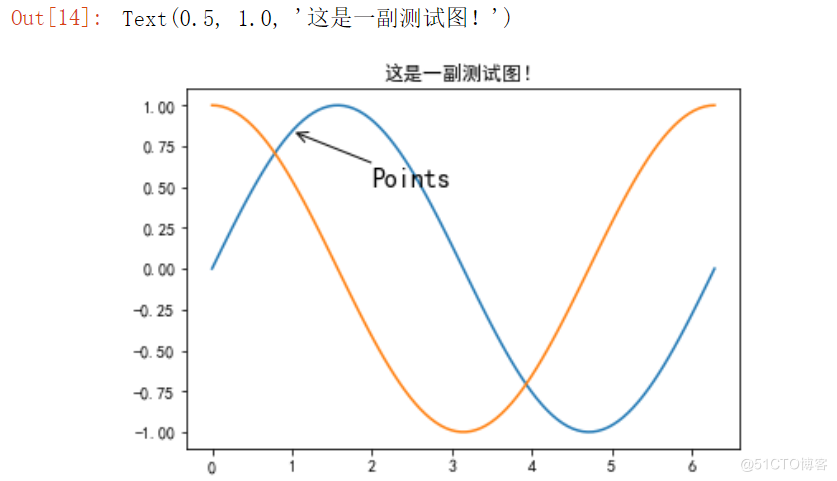
X = np.linspace(0, 2*np.pi,100)# 均匀的划分数据
Y = np.sin(X)
Y1 = np.cos(X)

plt.plot(X,Y)
plt.plot(X,Y1)

plt.annotate('Points',
         xy=(1, np.sin(1)),
         xytext=(2, 0.5), fontsize=16,
         arrowprops=dict(arrowstyle="->"))

plt.title("这是一副测试图!")
三、多个图形描绘 subplots
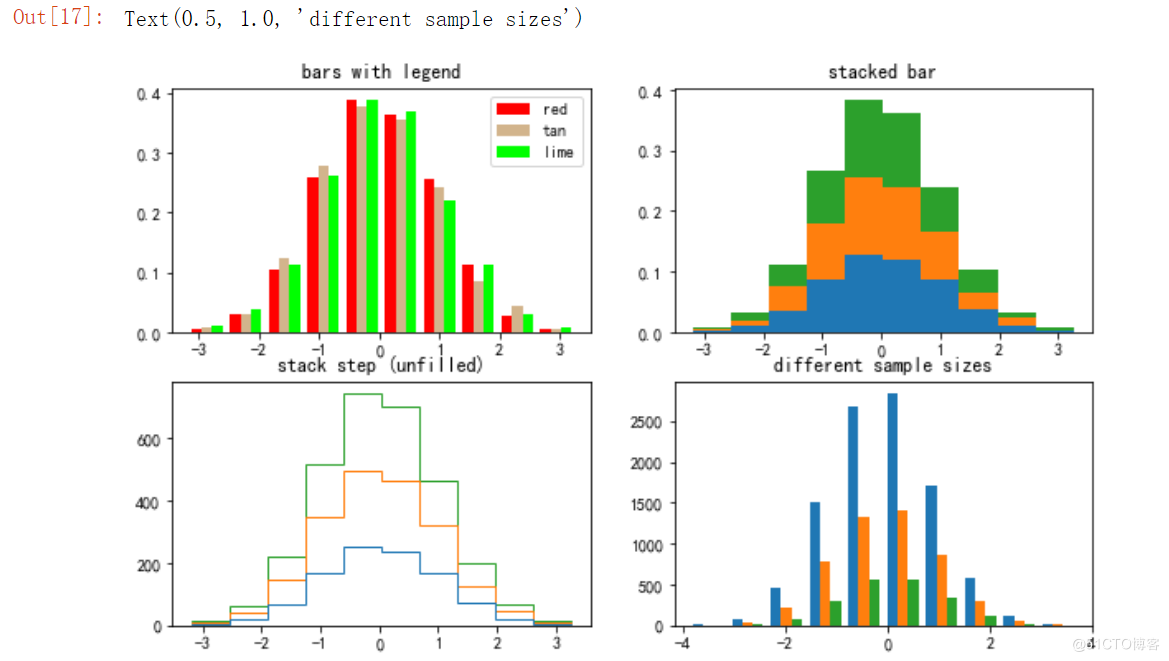
%pylab inline
pylab.rcParams['figure.figsize'] = (10, 6) # 调整图片大小

# np.random.seed(19680801)

n_bins = 10
x = np.random.randn(1000, 3)

fig, axes = plt.subplots(nrows=2, ncols=2)
ax0, ax1, ax2, ax3 = axes.flatten()

colors = ['red', 'tan', 'lime']
ax0.hist(x, n_bins, normed=1, histtype='bar', color=colors, label=colors)
ax0.legend(prop={'size': 10})
ax0.set_title('bars with legend')

ax1.hist(x, n_bins, normed=1, histtype='bar', stacked=True)
ax1.set_title('stacked bar')

ax2.hist(x, n_bins, histtype='step', stacked=True, fill=False)
ax2.set_title('stack step (unfilled)')

# Make a multiple-histogram of data-sets with different length.
x_multi = [np.random.randn(n) for n in [10000, 5000, 2000]]
ax3.hist(x_multi, n_bins, histtype='bar')
ax3.set_title('different sample sizes')
四、使用Pandas 绘图
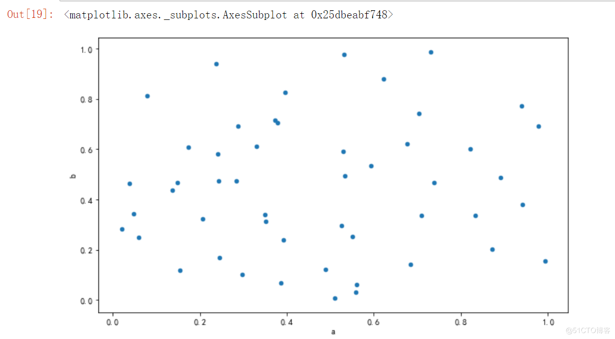
1、散点图
import pandas as pd
df = pd.DataFrame(np.random.rand(50, 2), columns=['a', 'b'])
# 散点图
df.plot.scatter(x='a', y='b')
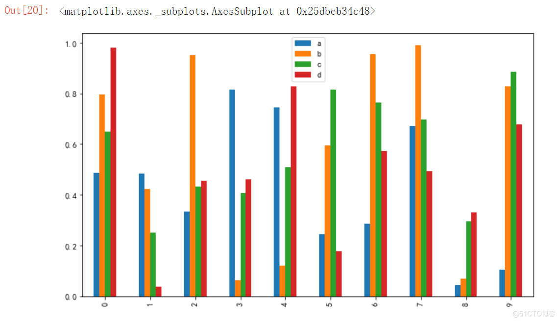
2、绘制柱状图
df = pd.DataFrame(np.random.rand(10,4),columns=['a','b','c','d'])
# 绘制柱状图
df.plot.bar()
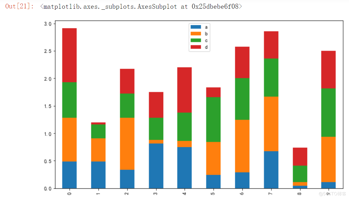
3、堆积的柱状图
# 堆积的柱状图
df.plot.bar(stacked=True)
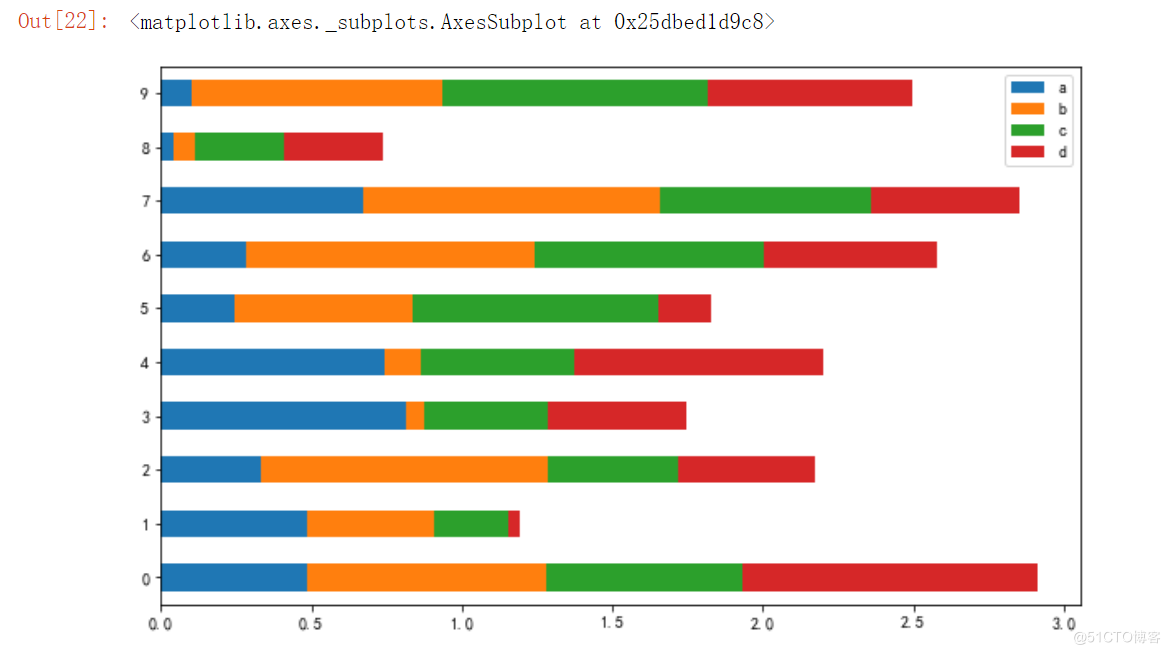
4、水平的柱状图
# 水平的柱状图
df.plot.barh(stacked=True)
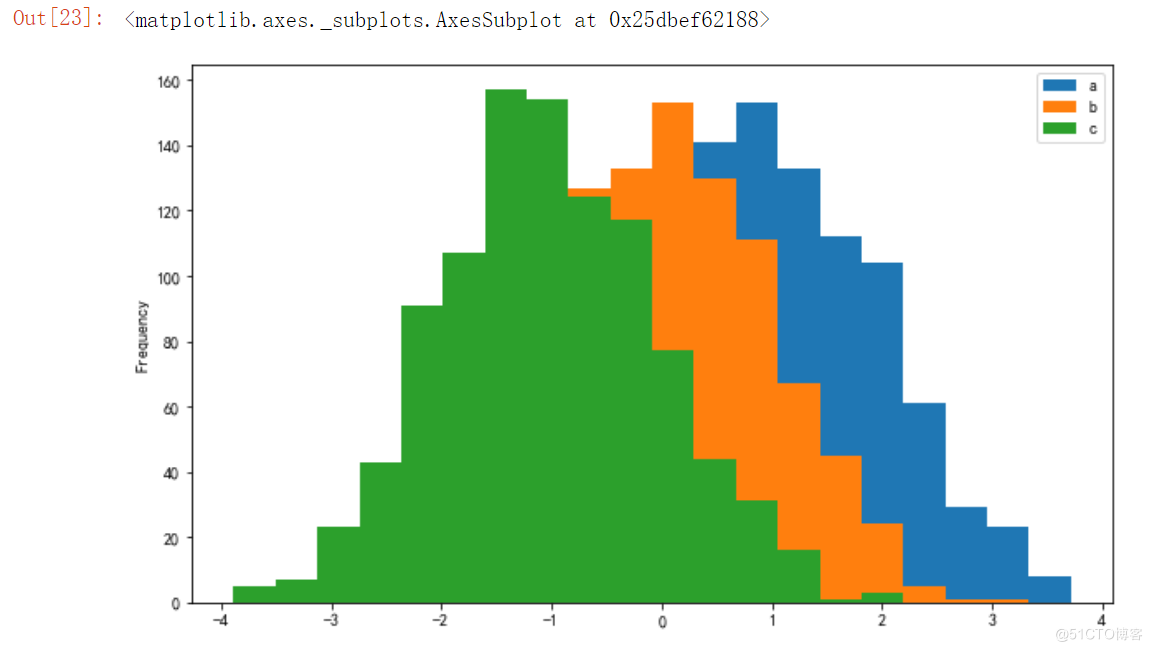
5、直方图
df = pd.DataFrame({'a':np.random.randn(1000)+1,'b':np.random.randn(1000),'c':np.random.randn(1000) - 1}, columns=['a', 'b', 'c'])

# 直方图
df.plot.hist(bins=20)
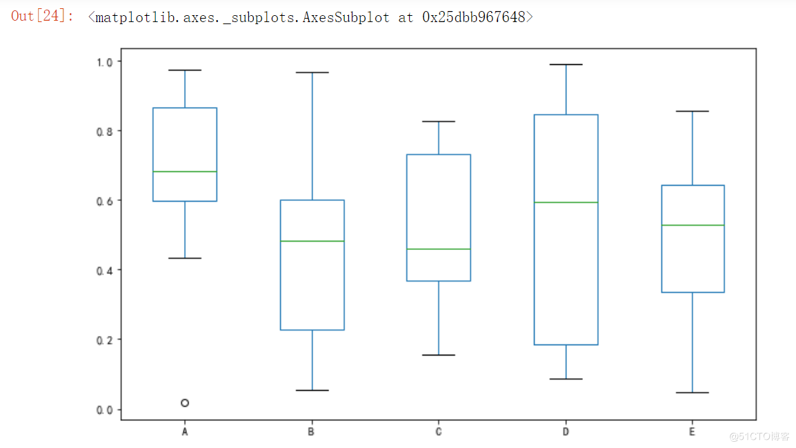
6、箱线图
# 箱线图
df = pd.DataFrame(np.random.rand(10, 5), columns=['A', 'B', 'C', 'D', 'E'])
df.plot.box()
到此这篇关于python通过Matplotlib绘制常见的几种图形(推荐)的文章就介绍到这了,更多相关python Matplotlib内容请搜索脚本之家以前的文章或继续浏览下面的相关文章希望大家以后多多支持脚本之家!
您可能感兴趣的文章:- Python使用matplotlib实现绘制自定义图形功能示例
- Python matplotlib绘图可视化知识点整理(小结)
- python matplotlib模块基本图形绘制方法小结【直线,曲线,直方图,饼图等】
- Python通过matplotlib绘制动画简单实例
- Python可视化Matplotlib介绍和简单图形的绘制


 咨 询 客 服


