flex弹性布局
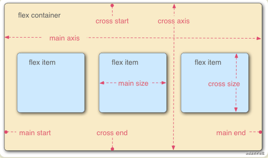
定义: Flex 布局的元素,称为 Flex 容器(flex container),简称"容器"。它的所有子元素自动成为容器成员,称为 Flex 项目
容器默认存在两根轴:水平的主轴( main axis )和垂直的交叉轴( cross axis )。
主轴的开始位置(与边框的交叉点)叫做 main start ,结束位置叫做 main end ;交叉轴的开始位置叫做 cross start ,结束位置叫做 cross end 。
项目默认沿主轴排列。单个项目占据的主轴空间叫做 main size ,占据的交叉轴空间叫做 cross size 。
弹性布局如何使用:只需要给容器设置 display:flex
容器属性
.box
{
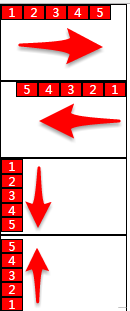
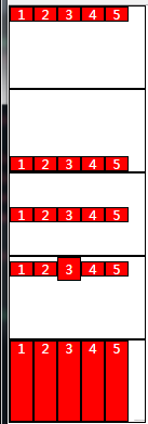
flex-direction: row | row-reverse | column | column-reverse;
}
row
row-reverse
column
column-reverse
<style>
    ul:nth-of-type(1){ flex-direction:row;}
    ul:nth-of-type(2){ flex-direction:row-reverse;}
    ul:nth-of-type(3){ flex-direction:column;}
    ul:nth-of-type(4){ flex-direction:column-reverse;}
</style>
.box
{
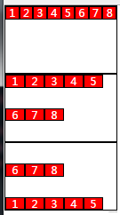
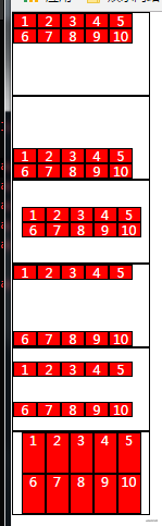
flex-wrap : nowrap| wrap | wrap-reverse ;
}
<style>
    ul:nth-of-type(1){flex-wrap:nowrap;}
    ul:nth-of-type(2){flex-wrap:wrap;}
    ul:nth-of-type(3){flex-wrap:wrap-reverse;}
</style>
.box
{
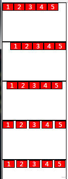
justify-content: flex-start | flex-end | center | space-between | space-around;
}
flex-start
flex-end
center
space-between
space-around
<style>
    ul:nth-of-type(1){justify-content:flex-start;}
    ul:nth-of-type(2){justify-content:flex-end;}
    ul:nth-of-type(3){justify-content:center;}
    ul:nth-of-type(4){justify-content:space-between;}
    ul:nth-of-type(5){justify-content:space-around;}
</style>
.box { align-items: flex-start | flex-end | center | baseline | stretch;}
flex-start
flex-end
center
baseline
stretch
<style>
    ul:nth-of-type(1){align-items:flex-start;}
    ul:nth-of-type(2){align-items:flex-end;}
    ul:nth-of-type(3){align-items:center;}
    ul:nth-of-type(4){align-items:baseline;}
    ul li{ height:auto;}
    ul:nth-of-type(5){align-items:stretch;}
</style>
align-content 属性定义了多根轴线的对齐方式。如果项目只有一根轴线,该属性不起作用。
.box {align-content: flex-start | flex-end | center | space-between | space-around | stretch;}
flex-start
flex-end
center
space-between
space-around
stretch
<style>
    ul:nth-of-type(1){ flex-wrap:wrap; align-content:flex-start;}
    ul:nth-of-type(2){ flex-wrap:wrap; align-content:flex-end;}
    ul:nth-of-type(3){ flex-wrap:wrap; align-content:center;justify-content:center;}
    ul:nth-of-type(4){ flex-wrap:wrap; align-content:space-between;}
    ul:nth-of-type(5){ flex-wrap:wrap; align-content:space-around;}
    ul li{ height:auto;}
    ul:nth-of-type(6){ flex-wrap:wrap;align-content: stretch; justify-content:center;}
</style>
简写方式:
flex-flow :
flex-flow 属性是 flex-direction 属性和 flex-wrap 属性的简写形式,默认值为 row nowrap 。 .
box {flex-flow: <flex-direction> || <flex-wrap>;}
项目属性
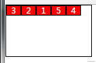
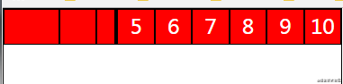
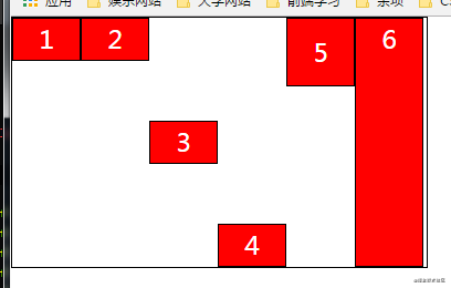
order 属性定义项目的排列顺序。数值越小,排列越靠前,默认为 0 。
.item {order: <integer>;}
<style>
    ul li:nth-of-type(3){order:1;}
    ul li:nth-of-type(2){order:2;}
    ul li:nth-of-type(1){order:3;}
    ul li:nth-of-type(5){order:4;}
    ul li:nth-of-type(4){order:5;}
</style>
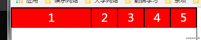
flex-grow 属性定义项目的放大比例,默认为 0 ,即如果存在剩余空间,也不放大。 如果所有项目的 flex-grow 属性都为 1 ,则它们将等分剩余空间(如果有的话)。如果一个项目的 flex-grow 属性为 2 ,其他项目都为 1 ,则前者占据的剩余空间将比其他项多一倍。
.item { flex-grow: <number>; /* default 0 */}
<style>
    ul li:nth-of-type(1){ flex-grow:1;}
    ul li:nth-of-type(2){ flex-grow:1;}
</style>
flex-shrink 属性定义了项目的缩小比例,默认为 1 ,即如果空间不足,该项目将缩小。
如果所有项目的 flex-shrink 属性都为 1 ,当空间不足时,都将等比例缩小。
如果一个项目的 flex-shrink 属性为 0 ,其他项目都为 1 ,则空间不足时,前者不缩小。
负值对该属性无效。
.item { flex-shrink: <number>; /* default 1 */}
<style>
    ul li:nth-of-type(1){flex-shrink:0;}
    ul li:nth-of-type(2){flex-shrink:1;}
    ul li:nth-of-type(3){flex-shrink:2;}
    ul li:nth-of-type(4){flex-shrink:3;}
</style>
flex-basis 属性定义了在分配多余空间之前,项目占据的主轴空间( main size )。浏览器根据这个属性,计算主轴是否有多余空间。它的默认值为 auto ,即项目的本来大小。它可以设为跟width或height属性一样的值(比如 350px ),则项目将占据固定空间。
.item { flex-basis: <length> | auto; /* default auto */}
<style>
    ul li:nth-of-type(1){ flex-basis:50%;}
</style>
align-self 属性允许单个项目有与其他项目不一样的对齐方式,可覆盖 align-items 属性。默认值为 auto ,表示继承父元素的 align-items 属性,如果没有父元素,则等同于 stretch 。
.item { align-self: auto | flex-start | flex-end | center | baseline | stretch;}
<style>
    ul{align-items:flex-start;}
    ul li{height: auto}
    ul li:nth-of-type(1){ align-self:auto;}
    ul li:nth-of-type(2){ align-self:flex-start;}
    ul li:nth-of-type(3){ align-self:center; }
    ul li:nth-of-type(4){ align-self:flex-end;}
    ul li:nth-of-type(5){ align-self:baseline;line-height: 80px;}
    ul li:nth-of-type(6){ align-self:stretch;}
</style>
flex 属性
flex 属性是 flex-grow , flex-shrink 和 flex-basis 的简写,默认值为 0 1 auto 。后两个属性可选。
.item { flex: none | [ <'flex-grow'> <'flex-shrink'>? || <'flex-basis'> ]}
该属性有两个快捷值: auto (1 1 auto) 和 none (0 0 auto) 。
建议优先使用这个属性,而不是单独写三个分离的属性,因为浏览器会推算相关值。
媒体查询
<!DOCTYPE html>
<html>

<head>
    <title></title>
</head>

<body>
</body>
<script type="text/javascript">
/*
viewport
定义:viewport就是设备的屏幕上能用来显示我们的网页的那一块区域,css中的1px并不等于设备的1px:因为像素密度不同
    layout viewport:布局视口
    一般移动设备的浏览器都默认设置了一个viewport元标签,定义一个虚拟的layout viewport,用于解决早期页面手机上显示的问题
    visual viewport :可视视口
    设置物理屏幕的可视区域,屏幕显示的物理像素,同样的屏幕,像素密度大的设备,可现实的像素会更多
    ideal viewport   :理想视口
    通过metab标签来得到理想视口
    示例:<meta name="viewport" content="width=device-width, initial-scale=1.0 maximum-scale=1.0">

* 移动端布局
    * meta标签的content属性的值
    * width=device-width,height=device-height,让当前的viewport宽度,高度等于设备的宽度,高度,也可以设置一个固定的值,尽量不使用height
    * initial-scale=1.0;初始化缩放比例:0.25-1.0
    * maximum-sacle=1.0;设置最大缩放比例:0.25-1.0
    * minimum-scale=1.0;设置最小缩比例:0.25-1.0
    * user-scalable=no;是否允许用户缩放,默认为yes,如果设置为no:那么minimax-scale,与maximum-scale将被忽略,因为不允许缩放
    * 实例:
    * <meta id="viewport" name="viewport" content="width=device-width, initial-scale=1.0, maximum-scale=1, user-scalable=no">

* 移动端手势事件
    * 与pc端事件差异对比
    * pc端的mousemove,mouseup,mousedown,在移动端会失效或者不正常
    * pc端的click事件可以使用,|   不要说300ms问题   |  但是会有300ms延迟问题:手机早期:用于断定是否是双击放大缩小
    *
    * 移动端事件
    * touchstart:手指按下触发
    * touchmove:手指移动时触发
    * touched:手指离开时触发
    * touchcancel:事件被打断是触发
    *
    * 移动端事件执行顺序:touchstart->touchmove->touched->click
    *
    * touchEvent	  对象与pc端事件的差异对比,多了三个TouchList属性
    * touches         位于当前屏幕上的所有手指的一个列表
    * targetTouches   位于当前DOM对象上的手指的一个列表
    * changedTouhes   保存状态改变的手指对象的一个列表
    *
    * 每个TouchList中有多个对象,每个Touch对象的对象属性
    * screenX 相对屏幕左边的距离
    * screenY 相对屏幕上边的距离
    * clientX  相对浏览器左边的距离
    * clientY  相对浏览器上边的距离
    * pageX  相对页面左边的距离
    * pageY  相对页面上边的距离
    * target  触摸的当前元素
    * identifier 当前触摸对象的id,用于辨别手指
    * radiusX, radiusY  手指触摸的范围
*/
</script>
<style type="text/css">
/*媒体查询一*/
* {
    margin: 0;
    padding: 0;
}

body {
    background-color: pink;
}

/*使用@media query可以实现响应式布局效果,会根据不同的条件,去设置不同的样式*/
/*screen表示屏幕,min-width:1200px 表示宽度最小值是1200px换句话说就是当屏幕宽度大于等于1200px的时候是什么样式*/
@media only screen and (min-width:1200px) {

    /*这里写样式*/
    body {
        background-color: red;
    }
}

/*当屏幕宽度,大于800,小于1199显示的样式*/
@media only screen and (min-width: 800px) and (max-width:1199px) {
    body {
        background-color: aqua;
    }
}

/*当屏幕宽度,大于400,小于640显示的样式*/
/*//如果在媒体查询中没有衔接上的部分,会显示默认部分*/
@media only screen and (min-width: 400px) and (max-width: 640px) {
    body {
        background-color: yellow;
    }
}
</style>
<!--
	媒体查询二
	<meta name="viewport" content="width=device-width, initial-scale=1.0 maximum-scale=1.0">
	<link rel="stylesheet" href="css/m320.css" media="only screen and (max-width:320px)">
	<link rel="stylesheet" href="css/m375.css" media="only screen and (min-width:321px) and (max-width:375px)">
	<link rel="stylesheet" href="css/m414.css" media="only screen and (min-width:376px) and (max-width:414px)">
 -->

</html>
移动端点击事件
<!DOCTYPE html>
<html>

<head>
    <title></title>
</head>

<body>
</body>
<script type="text/javascript">
// 移动端手势
var box = document.querySelector('#box')
//pc端的click事件
box.addEventListener('click', function(e) {
    console.log('===========click============');
    console.log(e);
});
//手指按下
box.addEventListener('touchstart', function(e) {
    console.log('===========touchstart============');
    //            Fn(e);
})
//手指移动
box.addEventListener('touchmove', function(e) {
    console.log('==========touchmove===========');
    Fn(e);
})
//手指抬起
box.addEventListener('touchend', function() {
    console.log('============touchend==========');
});
//被打断后出发
box.addEventListener('touchcancel', function() {
    alert('============被打断了================');
})

var touchesH1 = document.querySelector('#box h1:nth-of-type(1)');
var targettouchesH1 = document.querySelector('#box h1:nth-of-type(2)');
var changetouchesH1 = document.querySelector('#box h1:nth-of-type(3)');

function Fn(e) {
    touchesH1.innerHTML = 'touches' + e.touches.length;
    targettouchesH1.innerHTML = 'targettouches' + e.targetTouches.length;
    changetouchesH1.innerHTML = 'changetouches' + e.changedTouches.length;

}

// 使用touch库(移动端)
$('#box').tap(function() {
    console.log('====tap====')
})
$('#box').longTap(function() {
    console.log('====long tap====')
})
$('#box').doubleTap(function() {
    console.log('====double tap====')
})

$('#box').swiperLeft(function() {
    console.log('====left tap====')
})

// 使用zepto库(移动端)
$("#box").tap(function() {
    console.log('======tap=========');
})
$("#box").singleTap(function() {
    console.log('======singleTap=========');
})
$("#box").doubleTap(function() {
    console.log('======doubleTap=========');
})
$("#box").longTap(function() {
    console.log('======longTap=========');
})
$("#box").swipe(function() {
    console.log('======swipeTap=========');
})


// 自定义Touch事件库
//封装自定义的touch事件库
//注意:这里前面一个分号,是为了防止引用其他库的时候,那个库没有分号结尾,以后代码压缩的话容易出问题
;
(function(window, undefined) {
    var query = function(selector) {
        return query.fn.init(selector);
    };

    query.fn = query.prototype = {
        //初始化方法,就是模拟获取元素的方法,但这里获取的不是真正的元素,真正的元素存取在与整个对象的element属性中
        init: function(selector) {
            if (typeof selector == 'string') {
                this.element = document.querySelector(selector);
                return this;
            }
        },

        //单击,handler是回调函数,就是单击之后做出的响应功能
        tap: function(handler) {
            this.element.addEventListener('touchstart', touchFn);
            this.element.addEventListener('touchend', touchFn);

            //用来区分和长按的时间变量,做一个时间差判断
            var startTime, endTime;

            function touchFn(e) {
                switch (e.type) {
                    case 'touchstart':
                        //按下的时候记录一个时间
                        startTime = new Date().getTime();
                        break;
                    case 'touchend':
                        //离开的事件记录一个时间
                        endTime = new Date().getTime();
                        if (endTime - startTime < 500) {
                            //在手势离开的时候,回调
                            handler();
                        }

                        break;

                }
            }
        },
        //长按
        longTap: function(handler) {
            this.element.addEventListener('touchstart', touchFn);
            this.element.addEventListener('touchend', touchFn);
            //这个移动事件是为了解决与其他事件冲突问题
            this.element.addEventListener('touchmove', touchFn);
            var timeId;

            function touchFn(e) {
                switch (e.type) {
                    case 'touchstart':
                        //按下达到500ms,我们认为是长按
                        clearTimeout(timeId);

                        timeId = setTimeout(function() {
                            handler();
                        }, 500);
                        break;
                    case 'touchend':
                        //离开的时候清空定时器
                        clearTimeout(timeId);
                        break;
                    case 'touchmove':
                        //一旦移动了就清空长按定时器
                        clearTimeout(timeId);
                        break;

                }
            }
        },
        //双击
        doubleTap: function(handler) {
            this.element.addEventListener('touchstart', touchFn);
            this.element.addEventListener('touchend', touchFn);

            //记录次数
            var tapCount = 0,
                timeId;

            function touchFn(e) {
                switch (e.type) {
                    case 'touchstart':
                        //按下的时候记录一次
                        tapCount++;
                        //刚进来的时候,就清空一下定时器
                        clearTimeout(timeId);

                        timeId = setTimeout(function() {
                            //如果达到500ms,我们认为就不是双击,要把tapCount清零
                            tapCount = 0;
                        }, 500);
                        break;
                    case 'touchend':
                        //离开的时候清空定时器
                        if (tapCount == 2) {
                            //当按下2次的时候,才算双击
                            handler();
                            //触发双击之后,点击次数清零
                            tapCount = 0;
                            //清空定时器
                            clearTimeout(timeId);
                        }

                        break;

                }
            }
        },
        //左滑
        swiperLeft: function(handler) {
            this.element.addEventListener('touchstart', touchFn);
            this.element.addEventListener('touchend', touchFn);

            //手势触发的坐标
            var startX, startY, endX, endY;

            function touchFn(e) {
                switch (e.type) {
                    case 'touchstart':
                        //按下的时候记录起始的坐标
                        startX = e.targetTouches[0].pageX;
                        startY = e.targetTouches[0].pageY;
                        break;
                    case 'touchend':
                        //离开的时候记录下终止坐标
                        endX = e.changedTouches[0].pageX;
                        endY = e.changedTouches[0].pageY;
                        //判断是否是左右滑&& //判断具体是左滑,还是右滑
                        if (Math.abs(endX - startX) >= Math.abs(endY - startY) && (startX - endX) >= 25) {
                            handler();
                        }
                        break;

                }
            }
        },
    }
    query.fn.init.prototype = query.fn;
    window.$ = window.query = query;
}(window, undefined))
</script>

</html>
到此这篇关于CSS弹性布局FLEX,媒体查询及移动端点击事件的实现的文章就介绍到这了,更多相关CSS弹性布局内容请搜索脚本之家以前的文章或继续浏览下面的相关文章,希望大家以后多多支持脚本之家!


 咨 询 客 服