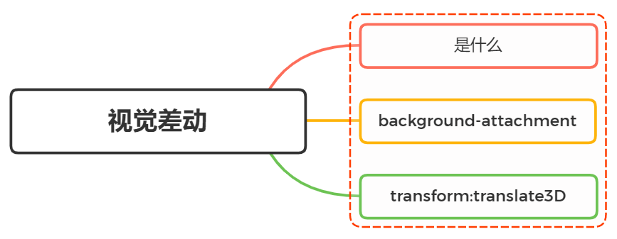
一、是什么
视差滚动(Parallax Scrolling)是指多层背景以不同的速度移动,形成立体的运动效果,带来非常出色的视觉体验
我们可以把网页解刨成:背景层、内容层、悬浮层
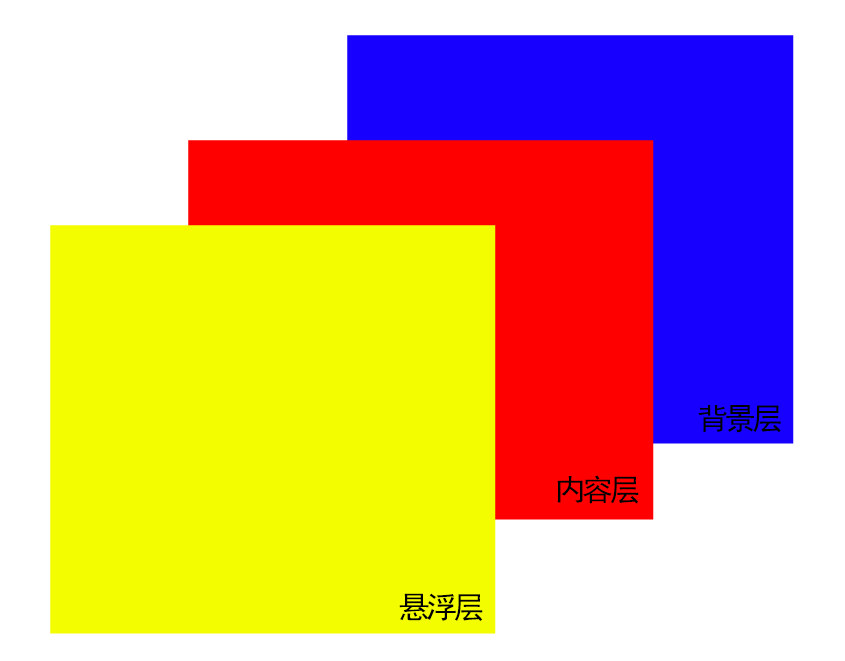
当滚动鼠标滑轮的时候,各个图层以不同的速度移动,形成视觉差的效果
二、实现方式
使用css形式实现视觉差滚动效果的方式有:
- background-attachment
- transform:translate3D
background-attachment
作用是设置背景图像是否固定或者随着页面的其余部分滚动
值分别有如下:
- scroll:默认值,背景图像会随着页面其余部分的滚动而移动
- fixed:当页面的其余部分滚动时,背景图像不会移动
- inherit:继承父元素background-attachment属性的值
完成滚动视觉差就需要将background-attachment属性设置为fixed,让背景相对于视口固定。及时一个元素有滚动机制,背景也不会随着元素的内容而滚动
也就是说,背景一开始就已经被固定在初始的位置
核心的css代码如下:
section {
    height: 100vh;
}

.g-img {
    background-image: url(...);
    background-attachment: fixed;
    background-size: cover;
    background-position: center center;
}
整体例子如下:
<style>
div {
            height: 100vh;
            background: rgba(0, 0, 0, .7);
            color: #fff;
            line-height: 100vh;
            text-align: center;
            font-size: 20vh;
        }

        .a-img1 {
            background-image: url(https://images.pexels.com/photos/1097491/pexels-photo-1097491.jpeg);
            background-attachment: fixed;
            background-size: cover;
            background-position: center center;
        }

        .a-img2 {
            background-image: url(https://images.pexels.com/photos/2437299/pexels-photo-2437299.jpeg);
            background-attachment: fixed;
            background-size: cover;
            background-position: center center;
        }

        .a-img3 {
            background-image: url(https://images.pexels.com/photos/1005417/pexels-photo-1005417.jpeg);
            background-attachment: fixed;
            background-size: cover;
            background-position: center center;
        }
</style>
 <div class="a-text">1</div>
    <div class="a-img1">2</div>
    <div class="a-text">3</div>
    <div class="a-img2">4</div>
    <div class="a-text">5</div>
    <div class="a-img3">6</div>
    <div class="a-text">7</div>
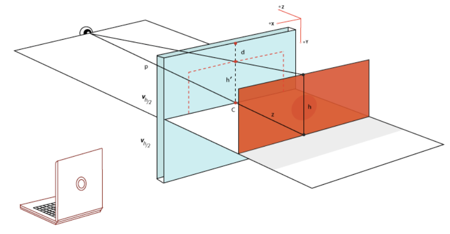
transform:translate3D
同样,让我们先来看一下两个概念transform和perspective:
- transform: css3 属性,可以对元素进行变换(2d/3d),包括平移 translate,旋转 rotate,缩放 scale,等等
- perspective: css3 属性,当元素涉及 3d 变换时,perspective 可以定义我们眼睛看到的 3d 立体效果,即空间感
3D视角示意图如下所示:
举个例子:
<style>
    html {
        overflow: hidden;
        height: 100%
    }

    body {
        /* 视差元素的父级需要3D视角 */
        perspective: 1px;
        transform-style: preserve-3d;
        height: 100%;
        overflow-y: scroll;
        overflow-x: hidden;
    }
    #app{
        width: 100vw;
        height:200vh;
        background:skyblue;
        padding-top:100px;
    }
    .one{
        width:500px;
        height:200px;
        background:#409eff;
        transform: translateZ(0px);
        margin-bottom: 50px;
    }
    .two{
        width:500px;
        height:200px;
        background:#67c23a;
        transform: translateZ(-1px);
        margin-bottom: 150px;
    }
    .three{
        width:500px;
        height:200px;
        background:#e6a23c;
        transform: translateZ(-2px);
        margin-bottom: 150px;
    }
</style>
<div id="app">
    <div class="one">one</div>
    <div class="two">two</div>
    <div class="three">three</div>
</div>
而这种方式实现视觉差动的原理如下:
- 容器设置上 transform-style: preserve-3d 和 perspective: xpx,那么处于这个容器的子元素就将位于3D空间中,
- 子元素设置不同的 transform: translateZ(),这个时候,不同元素在 3D Z轴方向距离屏幕(我们的眼睛)的距离也就不一样
- 滚动滚动条,由于子元素设置了不同的 transform: translateZ(),那么他们滚动的上下距离 translateY 相对屏幕(我们的眼睛),也是不一样的,这就达到了滚动视差的效果
以上就是CSS完成视差滚动效果的详细内容,更多关于CSS 视差滚动效果的资料请关注脚本之家其它相关文章!


 咨 询 客 服