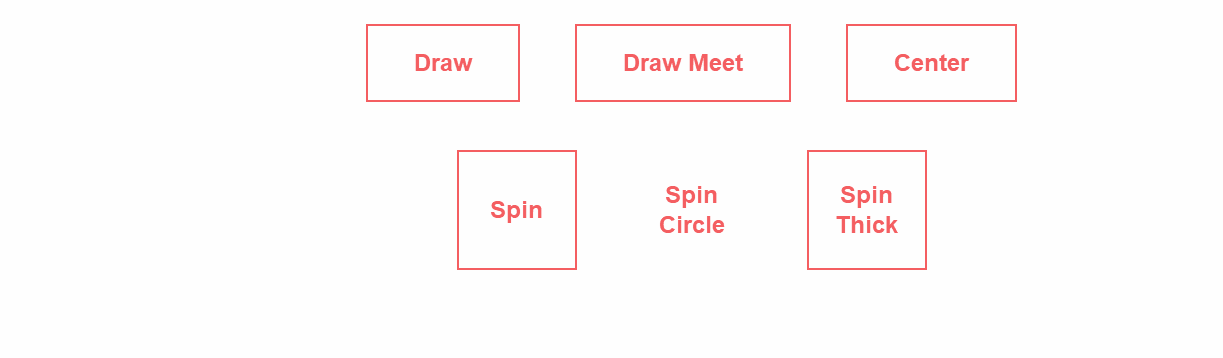
<h1>CSS Border Transitions</h1>

<section class="buttons">
  <button class="draw">Draw</button>

  <button class="draw meet">Draw Meet</button>

  <button class="center">Center</button>

  <button class="spin">Spin</button>

  <button class="spin circle">Spin Circle</button>

  <button class="spin thick">Spin Thick</button>
</section>
button {
  background: none;
  border: 0;
  box-sizing: border-box;
  margin: 1em;
  padding: 1em 2em;
  box-shadow: inset 0 0 0 2px #f45e61;
  color: #f45e61;
  font-size: inherit;
  font-weight: 700;
  position: relative;
  vertical-align: middle;
}
button::before, button::after {
  box-sizing: inherit;
  content: "";
  position: absolute;
  width: 100%;
  height: 100%;
}

.draw {
  transition: color 0.25s;
}
.draw::before, .draw::after {
  border: 2px solid transparent;
  width: 0;
  height: 0;
}
.draw::before {
  top: 0;
  left: 0;
}
.draw::after {
  bottom: 0;
  right: 0;
}
.draw:hover {
  color: #60daaa;
}
.draw:hover::before, .draw:hover::after {
  width: 100%;
  height: 100%;
}
.draw:hover::before {
  border-top-color: #60daaa;
  border-right-color: #60daaa;
  transition: width 0.25s ease-out, height 0.25s ease-out 0.25s;
}
.draw:hover::after {
  border-bottom-color: #60daaa;
  border-left-color: #60daaa;
  transition: border-color 0s ease-out 0.5s, width 0.25s ease-out 0.5s, height 0.25s ease-out 0.75s;
}

.meet:hover {
  color: #fbca67;
}
.meet::after {
  top: 0;
  left: 0;
}
.meet:hover::before {
  border-top-color: #fbca67;
  border-right-color: #fbca67;
}
.meet:hover::after {
  border-bottom-color: #fbca67;
  border-left-color: #fbca67;
  transition: height 0.25s ease-out, width 0.25s ease-out 0.25s;
}

.center:hover {
  color: #6477b9;
}
.center::before, .center::after {
  top: 0;
  left: 0;
  height: 100%;
  width: 100%;
  transform-origin: center;
}
.center::before {
  border-top: 2px solid #6477b9;
  border-bottom: 2px solid #6477b9;
  transform: scale3d(0, 1, 1);
}
.center::after {
  border-left: 2px solid #6477b9;
  border-right: 2px solid #6477b9;
  transform: scale3d(1, 0, 1);
}
.center:hover::before, .center:hover::after {
  transform: scale3d(1, 1, 1);
  transition: transform 0.5s;
}

.spin {
  width: 5em;
  height: 5em;
  padding: 0;
}
.spin:hover {
  color: #0eb7da;
}
.spin::before, .spin::after {
  top: 0;
  left: 0;
}
.spin::before {
  border: 2px solid transparent;
}
.spin:hover::before {
  border-top-color: #0eb7da;
  border-right-color: #0eb7da;
  border-bottom-color: #0eb7da;
  transition: border-top-color 0.15s linear, border-right-color 0.15s linear 0.1s, border-bottom-color 0.15s linear 0.2s;
}
.spin::after {
  border: 0 solid transparent;
}
.spin:hover::after {
  border-top: 2px solid #0eb7da;
  border-left-width: 2px;
  border-right-width: 2px;
  transform: rotate(270deg);
  transition: transform 0.4s linear 0s, border-left-width 0s linear 0.35s;
}

.circle {
  border-radius: 100%;
  box-shadow: none;
}
.circle::before, .circle::after {
  border-radius: 100%;
}

.thick {
  color: #f45e61;
}
.thick:hover {
  color: #fff;
  font-weight: 700;
}
.thick::before {
  border: 2.5em solid transparent;
  z-index: -1;
}
.thick::after {
  mix-blend-mode: color-dodge;
  z-index: -1;
}
.thick:hover::before {
  background: #f45e61;
  border-top-color: #f45e61;
  border-right-color: #f45e61;
  border-bottom-color: #f45e61;
  transition: background 0s linear 0.4s, border-top-color 0.15s linear, border-right-color 0.15s linear 0.15s, border-bottom-color 0.15s linear 0.25s;
}
.thick:hover::after {
  border-top: 2.5em solid #f45e61;
  border-left-width: 2.5em;
  border-right-width: 2.5em;
}

/* Page styling */
html {
  background: #fefefe;
}

body {
  background: #fefefe;
  color: #4b507a;
  font: 300 24px/1.5 Lato, sans-serif;
  margin: 1em auto;
  max-width: 36em;
  padding: 1em 1em 2em;
  text-align: center;
}

.buttons {
  isolation: isolate;
}

h1 {
  font-weight: 300;
  font-size: 2.5em;
}

 咨 询 客 服