先贴效果图:
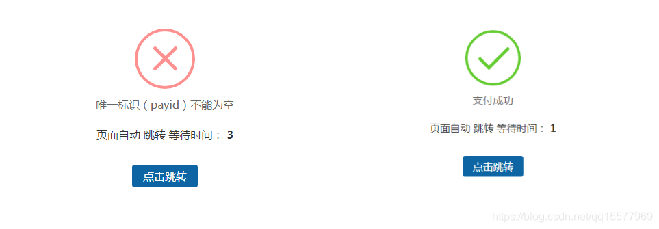
优点:图标是有动画效果的,不需要背景图片。
1、需要引用一个dialog.css,代码如下:
/* ===========================================
 @des:     dialog.less
 @author:   美奇软件开发工作室
 @QQ:     15577969
 @赞助平台:  元宝支付(18pay.net)
 @time:    2021-01-10
 =============================================*/

@charset "utf-8";
.clearfix {
 *zoom: 1;
}
.clearfix:after {
 visibility: hidden;
 display: block;
 font-size: 0;
 content: " ";
 clear: both;
 height: 0;
}
* {
 margin: 0;
 padding: 0;
}
ul,
ol {
 list-style: none;
}
img {
 border: none;
}
input,
select,
textarea {
 outline: none;
 border: none;
 background: none;
}
textarea {
 resize: none;
}
a {
 text-decoration: none;
}
.body {
 font-family: 14px "Microsoft Yahei", "微软雅黑", Arial, Tahoma;
}
.btn-container {
 width: 100%;
 display: flex;
 display: -webkit-flex;
 display: -moz-flex;
 justify-content: space-around;
 -webkit-justify-content: space-around;
 -moz-justify-content: space-around;
}
.btn-container input[type='button'] {
 width: 20%;
 padding: 0.357rem;
 color: #fff;
 border-radius: 3px;
 -webkit-radius: 3px;
 -moz-radius: 3px;
 background-color: #3B9DFF;
}
.btn-container input[type='button']:active {
 background-color: #1966b3;
}
/*重置盒模型 */
.boxContent * {
 box-sizing: content-box;
 -webkit-box-sizing: content-box;
 -moz-box-sizing: content-box;
}
/*animation start*/
#animationTipBox {
 width: 100%;
 height: auto;
 background-color: #fff;
 border-radius: 8px;
 -webkit-border-radius: 8px;
 -moz-border-radius: 8px;
 position: fixed;
 left: 50%;
 top: 30%;
 margin-left: -50%;
 margin-top: -75px;
 z-index: 1001;
 -webkit-animation: alertAnimation 0.3s ease-in-out 0s 1;
 -moz-animation: alertAnimation 0.3s ease-in-out 0s 1;
 animation: alertAnimation 0.3s ease-in-out 0s 1;
}
#animationTipBox * {
 box-sizing: content-box;
 -webkit-box-sizing: content-box;
 -moz-box-sizing: content-box;
}
#animationTipBox .icon {
 position: relative;
 width: 80px;
 height: 80px;
 border-radius: 50px;
 -webkit-border-radius: 50px;
 -moz-border-radius: 50px;
 border: 4px solid #66cc33;
 margin: 15px auto 5px auto;
}
#animationTipBox .icon_box {
 width: 80px;
 height: 80px;
 margin: 0 auto;
 text-align: center;
 position: relative;
}
#animationTipBox .lose .icon {
 border-color: #FF9090;
}
#animationTipBox .lose .icon_box {
 -webkit-animation: lose_Animation 0.5s ease 0s 1;
 -moz-animation: lose_Animation 0.5s ease 0s 1;
 animation: lose_Animation 0.5s ease 0s 1;
}
#animationTipBox .dec_txt {
 font-size: 16px;
 text-align: center;
 color: #666;
 line-height: 26px;
 height: 26px;
 padding: 5px 0 10px 0;
}
.tip .icon {
 width: 80px;
 height: 80px;
 background-color: #66cc33;
 border-radius: 100%;
 -webkit-border-radius: 100%;
 -moz-border-radius: 100%;
 color: #fff;
 font-size: 80px;
 text-align: center;
 line-height: 80px;
}
.success .line_short {
 width: 25px;
 height: 5px;
 position: absolute;
 left: 14px;
 top: 46px;
 border-radius: 4px;
 -webkit-border-radius: 4px;
 -moz-border-radius: 4px;
 background-color: #66cc33;
 transform: rotate(45deg);
 -webkit-transform: rotate(45deg);
 -moz-transform: rotate(45deg);
 -webkit-animation: success_short_Animation 0.65s ease 0s 1;
 -moz-animation: success_short_Animation 0.65s ease 0s 1;
 animation: success_short_Animation 0.65s ease 0s 1;
}
.success .line_long {
 width: 47px;
 height: 5px;
 position: absolute;
 right: 8px;
 top: 38px;
 border-radius: 4px;
 -webkit-border-radius: 4px;
 -moz-border-radius: 4px;
 background-color: #66cc33;
 transform: rotate(-45deg);
 -webkit-transform: rotate(-45deg);
 -moz-transform: rotate(-45deg);
 -webkit-animation: success_long_Animation 0.65s ease 0s 1;
 -moz-animation: success_long_Animation 0.65s ease 0s 1;
 animation: success_long_Animation 0.65s ease 0s 1;
}
.lose .line_left,
.lose .line_right {
 width: 47px;
 height: 5px;
 position: absolute;
 left: 17px;
 top: 37px;
 border-radius: 4px;
 -webkit-border-radius: 4px;
 -moz-border-radius: 4px;
 background-color: #FF9090;
 transform: rotate(45deg);
 -webkit-transform: rotate(45deg);
 -moz-transform: rotate(45deg);
}
.lose .line_right {
 right: 11px;
 top: 37px;
 transform: rotate(-45deg);
 -webkit-transform: rotate(-45deg);
 -moz-transform: rotate(-45deg);
}
/* 总体动画 函数 */
/*all animate*/
@-webkit-keyframes alertAnimation {
 0% {
  -webkit-transform: scale(0.5);
 }
 45% {
  -webkit-transform: scale(1.25);
 }
 80% {
  -webkit-transform: scale(0.95);
 }
 100% {
  -webkit-transform: scale(1);
 }
}
@-moz-keyframes alertAnimation {
 0% {
  -webkit-transform: scale(0.5);
 }
 45% {
  -webkit-transform: scale(1.25);
 }
 80% {
  -webkit-transform: scale(0.95);
 }
 100% {
  -webkit-transform: scale(1);
 }
}
@-webkit-keyframes alertAnimation {
 0% {
  -webkit-transform: scale(0.5);
 }
 45% {
  -webkit-transform: scale(1.25);
 }
 80% {
  -webkit-transform: scale(0.95);
 }
 100% {
  -webkit-transform: scale(1);
 }
}
/*all animate*/
/*success short animate*/
@-webkit-keyframes success_short_Animation {
 0% {
  width: 0;
  left: 1px;
  top: 19px;
 }
 54% {
  width: 0;
  left: 1px;
  top: 19px;
 }
 70% {
  width: 50px;
  left: -4px;
  top: 37px;
 }
 84% {
  width: 17px;
  left: 21px;
  top: 48px;
 }
 100% {
  width: 25px;
  left: 14px;
  top: 45px;
 }
}
@-moz-keyframes success_short_Animation {
 0% {
  width: 0;
  left: 1px;
  top: 19px;
 }
 54% {
  width: 0;
  left: 1px;
  top: 19px;
 }
 70% {
  width: 50px;
  left: -4px;
  top: 37px;
 }
 84% {
  width: 17px;
  left: 21px;
  top: 48px;
 }
 100% {
  width: 25px;
  left: 14px;
  top: 45px;
 }
}
@-webkit-keyframes success_short_Animation {
 0% {
  width: 0;
  left: 1px;
  top: 19px;
 }
 54% {
  width: 0;
  left: 1px;
  top: 19px;
 }
 70% {
  width: 50px;
  left: -4px;
  top: 37px;
 }
 84% {
  width: 17px;
  left: 21px;
  top: 48px;
 }
 100% {
  width: 25px;
  left: 14px;
  top: 45px;
 }
}
/*success short animate*/
/*success long animate*/
@-webkit-keyframes success_long_Animation {
 0% {
  width: 0;
  right: 46px;
  top: 54px;
 }
 65% {
  width: 0;
  right: 46px;
  top: 54px;
 }
 84% {
  width: 55px;
  right: 0px;
  top: 35px;
 }
 100% {
  width: 47px;
  right: 8px;
  top: 38px;
 }
}
@-moz-keyframes success_long_Animation {
 0% {
  width: 0;
  right: 46px;
  top: 54px;
 }
 65% {
  width: 0;
  right: 46px;
  top: 54px;
 }
 84% {
  width: 55px;
  right: 0px;
  top: 35px;
 }
 100% {
  width: 47px;
  right: 8px;
  top: 38px;
 }
}
@-webkit-keyframes success_long_Animation {
 0% {
  width: 0;
  right: 46px;
  top: 54px;
 }
 65% {
  width: 0;
  right: 46px;
  top: 54px;
 }
 84% {
  width: 55px;
  right: 0px;
  top: 35px;
 }
 100% {
  width: 47px;
  right: 8px;
  top: 38px;
 }
}
/*success long animate*/
/*load_Animation*/
@-webkit-keyframes load_Animation {
 0% {
  -webkit-transform: scale(0.6);
  opacity: 0.2;
 }
 50% {
  -webkit-transform: scale(0.6);
  opacity: 0.5;
 }
 80% {
  -webkit-transform: scale(1.15);
  opacity: 0.8;
 }
 100% {
  -webkit-transform: scale(1);
  opacity: 1.0;
 }
}
@-moz-keyframes load_Animation {
 0% {
  -webkit-transform: scale(0.6);
  opacity: 0.2;
 }
 50% {
  -webkit-transform: scale(0.6);
  opacity: 0.5;
 }
 80% {
  -webkit-transform: scale(1.15);
  opacity: 0.8;
 }
 100% {
  -webkit-transform: scale(1);
  opacity: 1.0;
 }
}
@-webkit-keyframes load_Animation {
 0% {
  -webkit-transform: scale(0.6);
  opacity: 0.2;
 }
 50% {
  -webkit-transform: scale(0.6);
  opacity: 0.5;
 }
 80% {
  -webkit-transform: scale(1.15);
  opacity: 0.8;
 }
 100% {
  -webkit-transform: scale(1);
  opacity: 1.0;
 }
}
/*load_Animation*/
/*lose_Animation*/
@-webkit-keyframes lose_Animation {
 0% {
  -webkit-transform: scale(0.6);
  opacity: 0.2;
 }
 50% {
  -webkit-transform: scale(0.6);
  opacity: 0.5;
 }
 80% {
  -webkit-transform: scale(1.15);
  opacity: 0.8;
 }
 100% {
  -webkit-transform: scale(1);
  opacity: 1.0;
 }
}
@-moz-keyframes lose_Animation {
 0% {
  -webkit-transform: scale(0.6);
  opacity: 0.2;
 }
 50% {
  -webkit-transform: scale(0.6);
  opacity: 0.5;
 }
 80% {
  -webkit-transform: scale(1.15);
  opacity: 0.8;
 }
 100% {
  -webkit-transform: scale(1);
  opacity: 1.0;
 }
}
@-webkit-keyframes lose_Animation {
 0% {
  -webkit-transform: scale(0.6);
  opacity: 0.2;
 }
 50% {
  -webkit-transform: scale(0.6);
  opacity: 0.5;
 }
 80% {
  -webkit-transform: scale(1.15);
  opacity: 0.8;
 }
 100% {
  -webkit-transform: scale(1);
  opacity: 1.0;
 }
}
/*lose_Animation*/
.load {
 position: relative;
 width: 60px;
 height: 80px;
 border-radius: 50px;
 -webkit-border-radius: 50px;
 -moz-border-radius: 50px;
 border: 4px solid #fff;
 margin: 15px auto 5px auto;
 top: 10px;
}
.load .icon_box {
 margin: 10px auto;
 width: 60px;
 height: 60px;
}
.load .cirBox1,
.load .cirBox2,
.load .cirBox3 {
 width: 60px;
 height: 60px;
 position: absolute;
 left: 0;
 top: 0;
}
.load .cirBox1 > div,
.load .cirBox2 > div,
.load .cirBox3 > div {
 width: 10px;
 height: 10px;
 border-radius: 100%;
 -webkit-border-radius: 100%;
 -moz-border-radius: 100%;
 background-color: #ccc;
 position: absolute;
}
.load .cirBox1 {
 transform: rotate(30deg);
 -webkit-transform: rotate(30deg);
 -moz-transform: rotate(30deg);
}
.load .cirBox2 {
 transform: rotate(60deg);
 -webkit-transform: rotate(60deg);
 -moz-transform: rotate(60deg);
}
.load .cirBox3 {
 transform: rotate(90deg);
 -webkit-transform: rotate(90deg);
 -moz-transform: rotate(90deg);
}
.load .cir1 {
 left: 0;
 top: 0;
}
.load .cir2 {
 right: 0;
 top: 0;
}
.load .cir3 {
 right: 0;
 bottom: 0;
}
.load .cir4 {
 left: 0;
 bottom: 0;
}
.load .cir1,
.load .cir2,
.load .cir3,
.load .cir4 {
 -webkit-animation: cir_Animation 1.2s ease 0s infinite;
 -moz-animation: cir_Animation 1.2s ease 0s infinite;
 animation: cir_Animation 1.2s ease 0s infinite;
}
.cirBox1 .cir2 {
 -webkit-animation-delay: -1.1s;
 -moz-animation-delay: -1.1s;
 animation-delay: -1.1s;
}
.cirBox1 .cir3 {
 -webkit-animation-delay: -0.8s;
 -moz-animation-delay: -0.8s;
 animation-delay: -0.8s;
}
.cirBox1 .cir4 {
 -webkit-animation-delay: -0.5s;
 -moz-animation-delay: -0.5s;
 animation-delay: -0.5s;
}
.cirBox2 .cir2 {
 -webkit-animation-delay: -1s;
 -moz-animation-delay: -1s;
 animation-delay: -1s;
}
.cirBox2 .cir3 {
 -webkit-animation-delay: -0.7s;
 -moz-animation-delay: -0.7s;
 animation-delay: -0.7s;
}
.cirBox2 .cir4 {
 -webkit-animation-delay: -0.4s;
 -moz-animation-delay: -0.4s;
 animation-delay: -0.4s;
}
.cirBox3 .cir2 {
 -webkit-animation-delay: -0.9s;
 -moz-animation-delay: -0.9s;
 animation-delay: -0.9s;
}
.cirBox3 .cir3 {
 -webkit-animation-delay: -0.6s;
 -moz-animation-delay: -0.6s;
 animation-delay: -0.6s;
}
.cirBox3 .cir4 {
 -webkit-animation-delay: -0.3s;
 -moz-animation-delay: -0.3s;
 animation-delay: -0.3s;
}
@-webkit-keyframes cir_Animation {
 0%,
 80%,
 100% {
  -webkit-transform: scale(0.4);
 }
 40% {
  -webkit-transform: scale(1);
 }
}
@-moz-keyframes cir_Animation {
 0%,
 80%,
 100% {
  -webkit-transform: scale(0.4);
 }
 40% {
  -webkit-transform: scale(1);
 }
}
@-webkit-keyframes cir_Animation {
 0%,
 80%,
 100% {
  -webkit-transform: scale(0.4);
 }
 40% {
  -webkit-transform: scale(1);
 }
}
.mask {
 width: 100%;
 height: 100%;
 background-color: #000;
 opacity: .8;
 position: fixed;
 left: 0;
 top: 0;
 z-index: 1000;
}
2、修改application/config.php里,默认跳转页面对应的模板文件
// 视图输出字符串内容替换
'view_replace_str'    => ['__STATIC__'=>'/static'],
// 默认跳转页面对应的模板文件
//'dispatch_success_tmpl' => THINK_PATH . 'tpl' . DS . 'dispatch_jump.tpl',
//'dispatch_error_tmpl'  => THINK_PATH . 'tpl' . DS . 'dispatch_jump.tpl',
'dispatch_success_tmpl' => THINK_PATH . 'tpl' . DS .'default_jump.tpl',
'dispatch_error_tmpl'  => THINK_PATH . 'tpl' . DS .'default_jump.tpl',
3、在thinkphp/tpl目录下新建一个default_jump.tpl,代码如下:
{__NOLAYOUT__}!DOCTYPE html PUBLIC "-//W3C//DTD XHTML 1.0 Transitional//EN" "http://www.w3.org/TR/xhtml1/DTD/xhtml1-transitional.dtd">
html xmlns="http://www.w3.org/1999/xhtml">
head>
  meta http-equiv="Content-Type" content="text/html; charset=utf-8" />
  meta name="viewport" content="width=device-width,initial-scale=1.0,minimum-scale=1.0,maximum-scale=1.0,user-scalable=no"/>
  title>跳转提示/title>
	!--引入dialog.css样式-->
  link rel="stylesheet" href="__STATIC__/css/dialog.css" rel="external nofollow" >
  style type="text/css">
		.system-message p{ text-align: center;}
		.system-message .jump{ padding-top: 10px}
		.system-message .jump a{ color: #333;}
		.system-message .jump-btn{margin-top: 40px}
		.system-message .jump-btn a{font-size: 16px;color: #fff;border-radius: 4px;background-color: #0d65a3;padding: 6px 16px;text-decoration: none;}
	/style>
/head>
body>
  div class="system-message">
		div id='animationTipBox'>
    ?php switch ($code) {?>
      ?php case 1:?>
			!--成功-->
				div class='success'>
				  div class='icon'>
					  div class='icon_box'>
						  div class='line_short'>/div>
						  div class='line_long'>/div>
					  /div>
				  /div>
					div class='dec_txt'>?php echo(strip_tags($msg));?>/div>
				/div>
      ?php break;?>
      ?php case 0:?>
			!--错误-->
				div class='lose'>
				  div class='icon'>
					  div class='icon_box'>
						  div class='line_left'>/div>
						  div class='line_right'>/div>
					  /div>
				  /div>
					div class='dec_txt'>?php echo(strip_tags($msg));?>/div>
				/div>
      ?php break;?>
    ?php } ?>
			p class="jump">
				页面自动a id="href" href="?php echo($url);?>" rel="external nofollow" >跳转/a> 等待时间: b id="wait">?php echo($wait);?>/b>
			/p>
			p class="jump-btn">a id="href" href="?php echo($url); ?>" rel="external nofollow" >点击跳转/a>/p>
		/div>
  /div>
  script type="text/javascript">
    (function(){
      var wait = document.getElementById('wait'),
        href = document.getElementById('href').href;
      var interval = setInterval(function(){
        var time = --wait.innerHTML;
        if(time = 0) {
          location.href = href;
          clearInterval(interval);
        };
      }, 1000);
    })();
  /script>
/body>
/html>
注意:dialog.css的路径要根据你自己的网站来写
到此这篇关于Thinkphp自定义美化success和error提示跳转页面代码实例的文章就介绍到这了,更多相关Thinkphp自定义美化success和error提示跳转页面内容请搜索脚本之家以前的文章或继续浏览下面的相关文章希望大家以后多多支持脚本之家!
您可能感兴趣的文章:- thinkPHP5框架auth权限控制类与用法示例
- ThinkPHP权限认证Auth实例详解
- ThinkPHP菜单无极分类实例讲解
- thinkphp5.1的model模型自动更新update_time字段实例讲解
- Thinkphp5.1获取项目根目录以及子目录路径的方法实例讲解
- Thinkphp使用Zxing扩展库解析二维码内容图文讲解
- ThinkPHP的标签制作实例讲解
- thinkphp的钩子的两种配置和两种调用方法
- 详解thinkphp的Auth类认证

 咨 询 客 服