本文主要介绍了纯html+css实现打字效果,具有一定的参考价值,感兴趣的可以了解一下
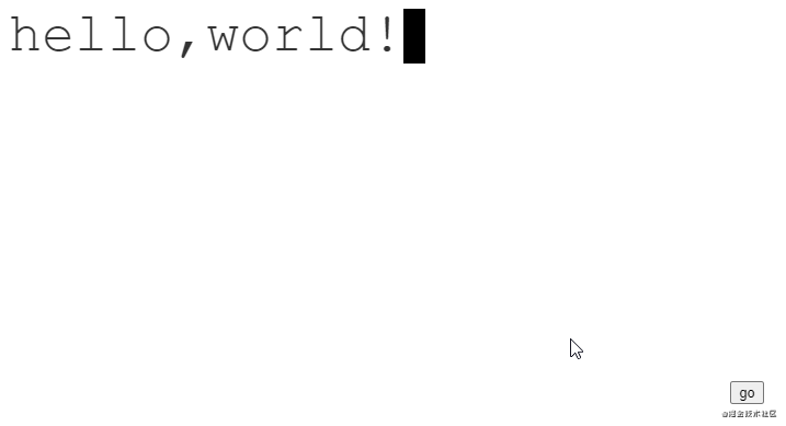
效果图
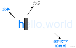
分析
可以将动画看做三个不同的层次:
文字是静止的,而中间的背景和最上层的光标是动态的。
初始时,背景挡住所有的文字,光标在最左边。
动画进行时,背景和光标以相同的步伐从左往右移动。
动画结束时,背景不再遮挡文字,光标则在最右边闪烁。
代码
html
<div class="text">hello,world!</div>
css
:root {
    /* 字符数量 */
    --steps: 12;
    /* 动画时间 */
    --duration: 2.5s;
    /* 字体大小 */
    --fontSize: 50px;
    /* 光标大小 */
    --cursorSize: 20px;
}

.text {
    color: #333;;
    position: relative;
    display: inline-block;
    font-family: 'Courier New', Courier, monospace;
    font-size: var(--fontSize);
    line-height: 1;
}

.text::after {
    content: '';
    width: var(--cursorSize);
    height: var(--fontSize);
    background-color: black;
    z-index: 2;
    position: absolute;
    animation: blink 1s var(--duration) step-end infinite,
               moveCursor var(--duration) steps(var(--steps)) forwards;
}

.text::before {
    content: '';
    width: 100%;
    height: var(--fontSize);
    z-index: 1;
    position: absolute;
    background: linear-gradient(#fff, #fff) no-repeat top right;
    animation: showText var(--duration) steps(var(--steps)) forwards;
}

/* 光标闪烁动画 */
@keyframes blink {
    0% {
        background-color: black;
    }
    50% {
        background-color: transparent;
    }
    100% {
        background-color: black;
    }
}

/* 光标移动动画 */
@keyframes moveCursor {
    0% {
        left: 0%;
    }
    100% {
        left: 100%;
    }
}

/* 背景移动动画 */
@keyframes showText {
    0% {
        background-size: 100% 100%;
    }
    100% {
        background-size: 0% 100%;
    }
}
注意
字体必须是等宽字体。因为光标每次移动的距离是是根据字符的数量 / 总宽度来决定的。
在线演示
到此这篇关于纯html+css实现打字效果的文章就介绍到这了,更多相关html css打字效果内容请搜索脚本之家以前的文章或继续浏览下面的相关文章,希望大家以后多多支持脚本之家!

 咨 询 客 服